

Google Mastery
Design, Illustration | Google
As a visual designer for Google’s Sales Mastery team, I was responsible for making icons, character illustrations, and other graphics that were used for instructional materials for Google’s sales team. These visuals had to adhere to Google’s strict style guide, while still feeling fun, fresh and unique. Assets I created include unique character designs, icon sets, and libraries of device and hand illustrations that could be re-used and re-purposed.
Along the way, I helped to establish rules for the Sales Mastery brand guidelines and a system of iconography that could be used for navigation through the various levels and categories of courses.
Below are a series of vector asset libraries, featuring assets produced by myself and the other visual designers on the Mastery Team. I produced a significant number of these assets, which were used to build unique illustrations at scale using modularity. For each character, we had multiple poses, outfits and facial expressions, allowing an almost infinite number of unique combinations. The character library was meant to represent people of all different cultures, body types and ages to be as inclusive as possible.
Different scales of illustration required different levels of fidelity. For large-scale scenes with multiple characters, faces were removed to create a simpler image.
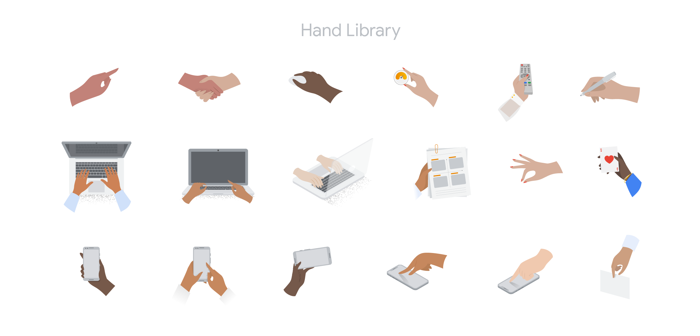
For full body characters, we used simplified four-finger hands. For close-up images, or images of devices, we used more realistic five-finger hands.


Below are just a few of the banner illustrations I designed for the Skillshop website, featuring simplified versions of the characters from the Mastery character set. In order to create a light, airy tone, the majority of the environments in these illustrations is rendered in tones of light gray, and the iconic Google colors are used only sparingly for emphasis in the foreground or on characters.

Selected spot illustrations

Explorations for how to display the icons I designed for navigating through Skillshop courses. These icons were meant to guide the user through the lessons. The icons at the top of the page would be a legend or quick reference, while the sidebar icons would be used for navigation and filtering.